The joy of screenshots
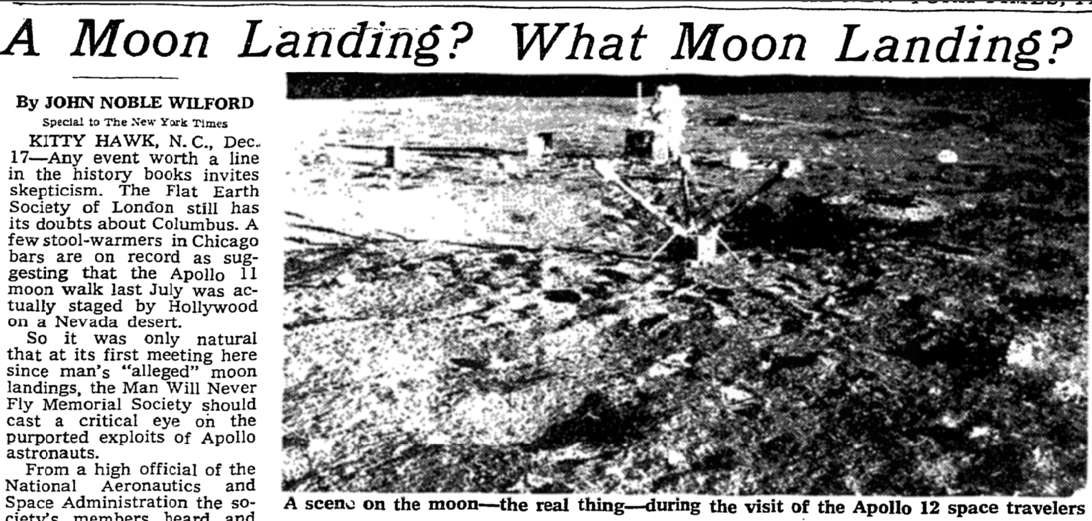
One of the most useful tools for blogging is screenshots. You can use a screenshot for all kinds of things. I find it particularly useful for including stuff that I find on the Internet. For instance, did you know that the NY Times reported in 1969 that there were folks who thought the moon landing was faked? A screenshot of the NY Times website tells the story:
Generally, the most useful kind of screenshot is where you select a region of your screen which you wish to include. To do this on Windows, press Windows-Shift-S, then drag over the area you wish to create an image of; on Mac, it’s Command-Shift-4.
By combining this with writing blogs in Microsoft Word or Google Docs it makes it particularly easy to include pictures in your posts. You don’t have to worry about finding special HTML syntax to embed a tweet, or downloading and resizing an appropriate sized image to include some photo that you found, or any other special approach for different kinds of content. Anything that appears on the screen, you can take a screenshot, so you can put it in your post!
The problem of giant screenshots
Unfortunately, you might notice that when you paste your screenshot into your blog post, and then publish it, that it appears way too big, and not as sharp as you would like. For instance, here is the “commit” example image from my blog post about using Github Desktop:
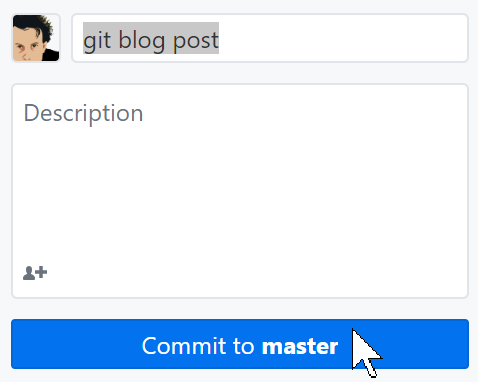
This is about twice as big as it actually appeared on my screen, and not nearly as sharp. To fix it, have a look at the markdown for the image:
And replace it instead with this special syntax (note that you don’t need to include the ‘/images/’ prefix in this form):
This appears the correct size, and with the same sharpness that it had on my screen (assuming you have a high-resolution screen too):
You can do this quite quickly by using your editor’s search and replace feature to replace \!\[\](/images/ with the appropriate syntax, and then replace the end of the lines with ‘ %}’ manually. (Of course, if you know how to use regular expressions in your editor, you can do it in one step!)
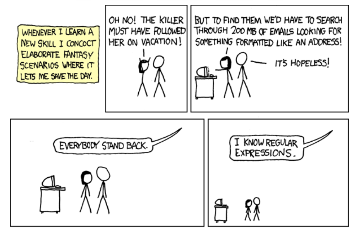
(This cartoon is from the wonderful XKCD.)
The gory details
So, what’s going on here? Frankly, it doesn’t matter in the slightest. Feel free to stop reading right now and go and to something more interesting. But, if you have nothing better to do, let’s talk a little bit about the arcane world of high-resolution displays and web browsers. (Many thanks to Ross Wightman for getting me on the right track to figuring this out!)
The basic issue is that your web browser does not define a “pixel” as… well, as a pixel. It actually defines it as 1/96 of an inch. The reason for this is that for a long time computer displays were 96 dots per inch. When screens started getting higher resolutions, as we moved from CRT to LCD displays, this caused a problem: things started looking too small. When a designer created something that was 96 pixels across, they had expected it to be 1 inch wide. But on a 200 dpi display it’s less than half an inch wide! So, the powers that be decided that the definition of a pixel in a web browser would remain as 1/96 of an inch, regardless of the actual size of pixels on your monitor.
But when I take a screenshot it actually has a specific number of pixels in it. When I then insert it into a webpage, my web browser decides to make each of those pixels take up 1/96 of an inch. And so now I have a giant image! There isn’t really one great way to fix this. Web forums are full of discussions amongst designers on various workarounds. But it turns out there’s a neat hack that generally works pretty well. Here’s what the HTML for an image normally looks like:
<img src="image.png">We can replace that with this slight variation:
<img srcset="image.png 2w" sizes="1px">The ‘2w’ and ‘1px’ tells the browser how we want to map the width of an image to pixels. All that matters is the ratio between these numbers, which in this case is 2. That means that the image will be scaled down by a factor of 2, and it will be done in a way that fully uses the viewers high-resolution display (if they have one).
This is a somewhat recent addition to web browsers, so if we also want this to work on people using older software, then we should include both the new and old approaches that we have seen, like so:
<img srcset="image.png 2w" sizes="1px" src="image.png”>It would be annoying to have to write that out by hand every time we wanted an image, but we can take advantage of something called Jekyll, which is the underlying templating approach that Github Pages uses. We can create our own template, that is, a small piece of text where we can fill in parameters later, like so:
<img srcset="/images/{{ include.url }} 2w" sizes="1px" src="/images/{{ include.url }}">In fast_template we have this saved in the filename “screenshot”, which is why we can use the convenient syntax we saw earlier:
